10 Competitor Logos - Book Publishers
This is the logo for HarperCollins. This logo is waves with flames directly above them. I don't like this logo because I don't really understand the premise of the waves and flames.
This is the logo for Penguin. I like this logo because of how the colours and design work together.
|
This is the logo for Katherine Tegen Books. I like this logo because of the geometric shapes throughout the logo.

This is the logo for Simon & Shuster. I don't like this logo because I don't like how the words aren't centered with the logo above them.
|
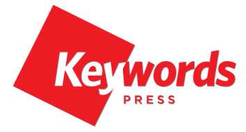
This is the logo for Keywords Press. I like this logo because I like how it is not too simple but there also isn't too much going on in it.
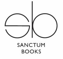
This is the logo for Sanctum Books. I don't like this logo because it is very plain and adding on to that, it only uses black in the design.
|
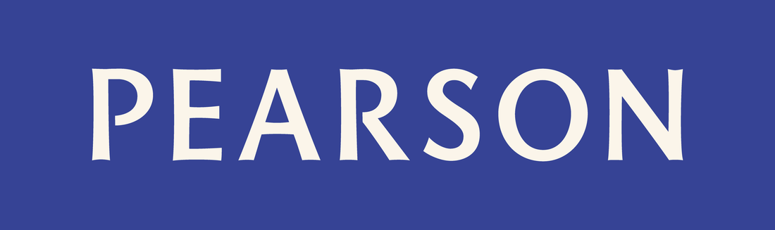
This is the logo for Pearson Canada. They publish mostly textbooks. I like this logo because, although it is just the company's name, it represents the company well, as they need to look professional.
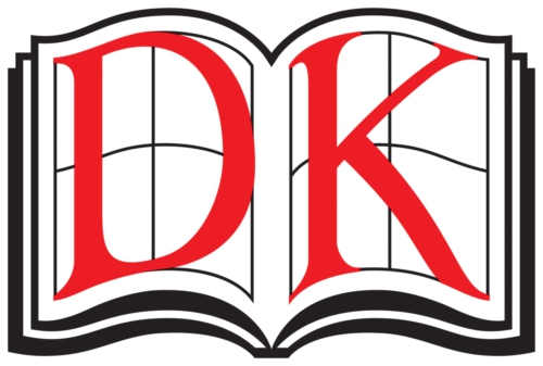
This is the logo for DK Publishing. This company publishes different types of illustrated books. I like this logo because you can tell that they don't publish books like novels. You can tell they publish illustrated books.
|
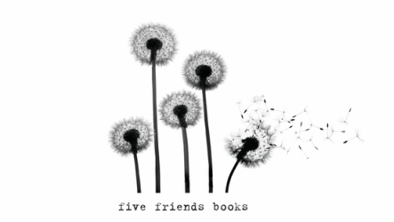
This is the logo for Five Friends Books. I like this logo because it is minimalistic but I also think that there is too much to look at.
|

This is the logo for Publishing Trendsetters. I like this logo because it is simple yet not too simple. I like how they matched the orange sun with setter. I like how everything looks very polished.
|
Creative Brief
Project Summary
1. My service that I offer is a book publishing company.
2. We just started our business 5 years ago,
3, I hope that people will see the company as a professional and efficient company.
4. My long term goals are to be publishing books from best-selling authors and to be doing so for many years.
Audience Profile
1. My existing audience is young adults. They like to see things that are aesthetically pleasing, as children like to see bright colours.
2. I would also like to add adults to the company's audience.
Perception/Tone/Guidelines
1. I would like to use darker colours, like navy blue or maroon, for my logo because I don't want the colours to be in your face, like neon pink or green.
2. I would like to have a book or some type of font using serifs for my logo.
Communication Strategy
1. My tagline is Leave it to your imagination.
2. The overall message I'm trying to convey to my target audience is that the company is very sophistacated,
3. My new logo will be used on books.
Competitive Positioning
1. My competitors are Keywords Press and Harper Collins. I think that their logos are very simple and well designed.
2. http://www.thekeywordspress.com, http://www.harpercollins.com
3. What sets me apart from my competitors is we are a student run company and very efficient at the same time.
Targeted Message
1. Imagine.
Logo